

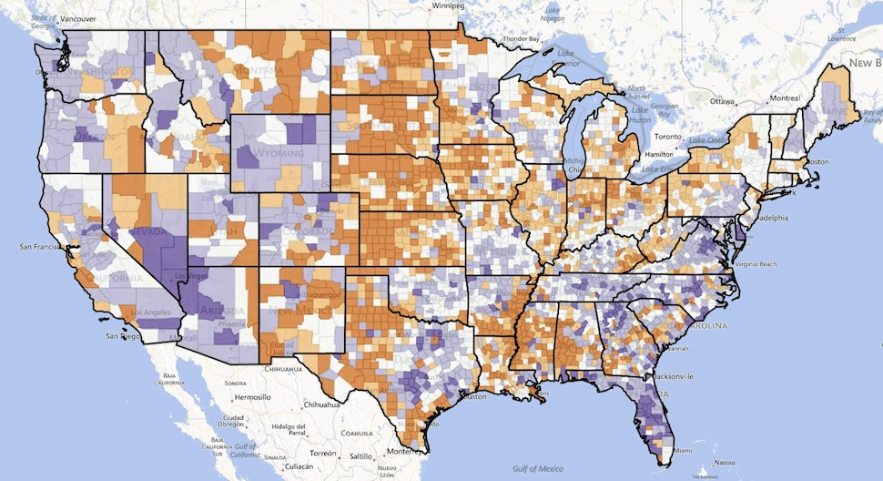
Each year, 10 million Americans pack up their lives and move to another part of the country. But where are they going? The University of Wisconsin-Madison has made an awesome interactive map that tracks the net migration to different counties across the U.S.
The map uses data sets that include age, race, Hispanic-origin, and sex to trace migration patterns from 1950 to 2010. Purple means that more people are moving to a county, and orange means more people are moving away from a county.
via Gizmodo